Animation 3

I have finished my third animation which is the final animation of Part 2. This animation was my most ambitious by far, and the story is more complex and challenging than anything I have created so far, but I am glad I took a risk and I think it has paid off. For this project, I looked at the genre of Film Noir, as it has a very particular style and characters that I thought I could explore in my own work. Several practitioners have influenced my work for this project including the cinematographer John Alton, the director Fritz Lang, and the comic book artist, Frank Miller. Each of these practitioners influenced me in different ways, from the lighting effects, to the use of colour, to the subject of the story. To accurately convey this period in film history, I also looked at slang for my script, and character designs.

The animation is not completely smooth and if I had more time to work on it there are several areas I would change, such as the close-up shots of the hands, the colouring and the glass shots. However, I think for three weeks of work that the animation is successful. I really enjoyed exploring the genre of film noir and it may be an area of cinema that I will return to looking at again one day as I find it so interesting.

Screen Shot 2015-02-01 at 13.47.43 Screen Shot 2015-02-01 at 13.47.55 Screen Shot 2015-02-01 at 13.48.03 Screen Shot 2015-02-01 at 13.50.24

Click here to watch my film noir animation!

Animation 2

I have just finished my second animation. The brief for this project was to create an animation based on factual material. I chose to focus on the subject of Classical Music and in particular the composer, J.S. Bach.

For this project, I looked at the work of Terry Gilliam and Bob Godfrey, and researched their styles to influence my own project. Inspired by their work, I used paper cut-outs and combined them with Photoshop animation.

The animation was a fact file about Bach and I used comedy to make the facts more entertaining. Simple facts such as the number of children he had and the number of pieces he composed were made more interesting my little visual symbols and jokes.

I am really happy with the animation as it flows quite well and smoothly while still allowing enough time for the audience to take in and enjoy the visuals and facts. When I showed this animation to my class, I was pleased with the number of people who found it funny and entertaining. I also liked using music this time in my work, as I think it makes the animation more engaging and works well with the movement and timing.

Screen Shot 2015-01-29 at 10.40.36 Screen Shot 2015-01-29 at 10.41.04

Screen Shot 2015-01-29 at 10.44.58 Screen Shot 2015-01-29 at 10.45.06

Click here to watch the animation

Animation 1

I have just finished my first animation in part 2. This animation was the first that I ever created on my own and I am really happy with the end result.

My animation is based around a young boy trying to go to sleep in his bedroom. However, he keeps imagining monsters under his bed. After checking under the bed to see what is there, the boy is able to go to sleep. At the end of the animation, the wardrobe door opens to reveal a monster’s face.

I hand-drew this animation and it was a very long and repetitive process. In the end, I hand-drew over 200 pages. I am quite happy with the quality of the animation but I think if I had more time, it would look better with more shading/colour.

Feedback about the project was quite positive and particularly the character of the boy was praised. The expressions and personality were really clear and I appreciated this feedback as it was something I had spent a lot of time on.

My favourite part of the animation is where the boy imagines different creatures under the bed. To show what the boy was thinking, I used a big thought bubble to fill the screen. In particular, I really like the movement with the spiders under the bed.

Screen Shot 2015-02-01 at 15.33.22 Screen Shot 2015-02-01 at 15.33.32 Screen Shot 2015-02-01 at 15.33.47

Click here to watch video

3D Design

This week, we started our 3D Design rotation – not a subject I knew much about at all before Foundation. Our theme of the week was Crisis and we had to design 3D pieces in response to a particular crisis.

On our first day, we researched existing pieces of design in response to crisis and I discovered 5 separate pieces of design. One of my favourites was a table called the Goliath Table by Resource Furniture. It’s a table that can stretch from a very narrow size to the size of a dining table. http://resourcefurniture.com/product/goliath/  I think it’s a great piece of design in response to a space crisis. On the Resource Furniture website, there’s a really good variety of space-saving furniture that is functional whilst still looking really modern.

After researching these items, it was our turn to design our own pieces. I found this part of the week really challenging and I struggled to come up with designs that were functional, original, imaginative and inventive. Every idea I came up with seemed to be already invented. Eventually, I settled on the idea of modular seating – a sofa built up from cubes that could be rearranged to create a chair, a bed, etc.

Sketchbook page

Sketchbook page

On our last day of the week, we had to build a model/prototype of the design. I began to create my furniture idea out of cardboard cubes, until I was told by the teacher that my design wasn’t original after all. After failing to think of something new to add to my furniture design, I decided to return to one of my other initial ideas – a non-slip ladder. At this time, I had about an hour left to create something and so I didn’t have any in-depth research about my ladder idea. Even so, I made it out of cardboard, adapting the idea as I went.

IMG_0421


This is a picture of my final model I created out of cardboard. I eventually settled on the idea of a hollow ladder frame that you could fill with water or sand to weigh it down. Overall, I wasn’t particularly pleased with my work this week and I think that this was the most challenging task yet. I have to say that this isn’t my area of expertise.

Tagged , , , , , ,

Mix

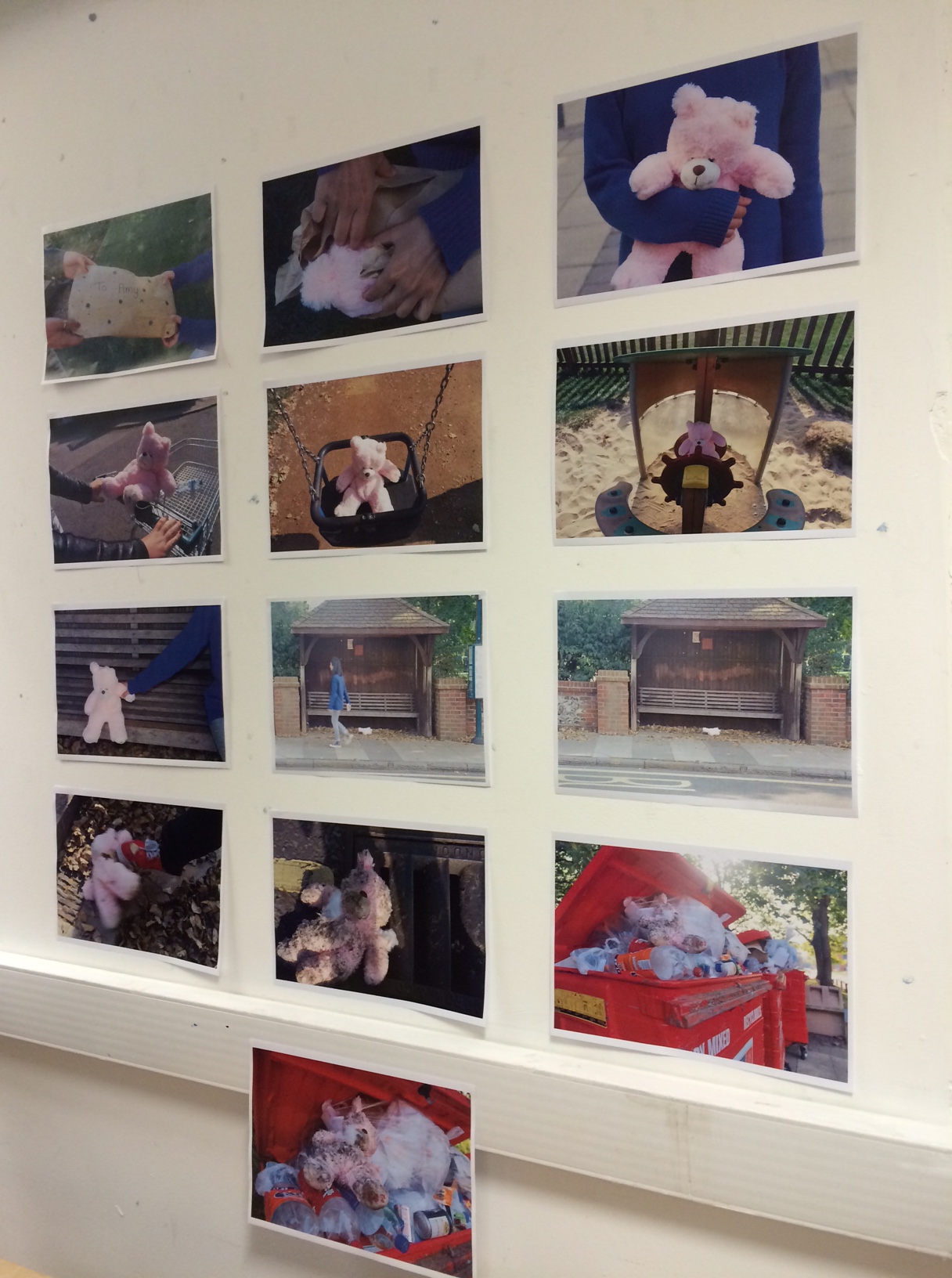
This  week was the week of Mix – not a pathway but a chance to experiment with drawing as well as a trip to London.

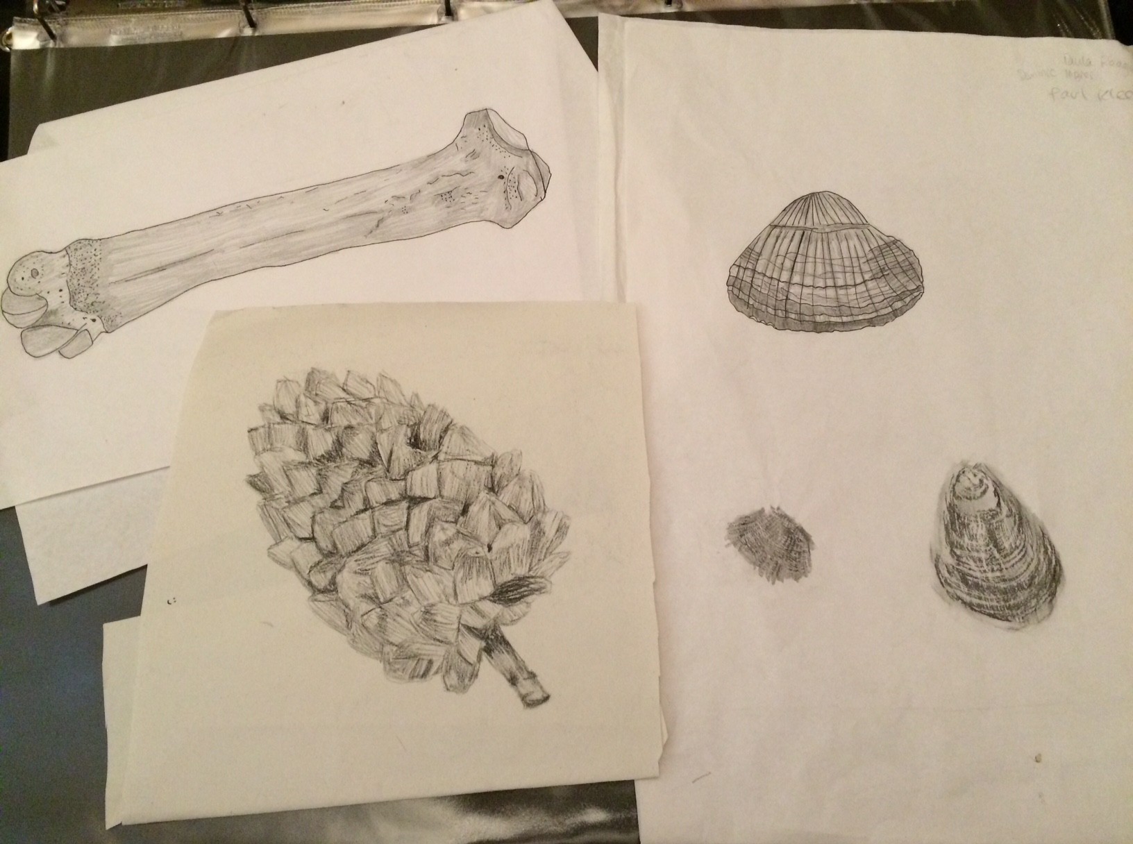
On Monday morning, we began by drawing a variety of objects including shells, bones, bottles and pinecones. Each of the objects presented new challenges – the pattern of the shells, the texture of the pinecone and the shadow on the bone – and therefore we had to use different techniques to represent each object differently. I used a variety of materials including charcoal, pencil, fine liner, felt tip, and taking rubbings of the shells using a graphite pencil. My favourite of the drawings was actually the rubbing of the shell as I felt it showed the texture and pattern really well. I also enjoyed drawing the bone, as it was so different to objects that I had drawn before. I used a combination of pencil – to show the shape and shadow – and fine liner – to define the strong edges.

IMG_0415

My drawings from Day One

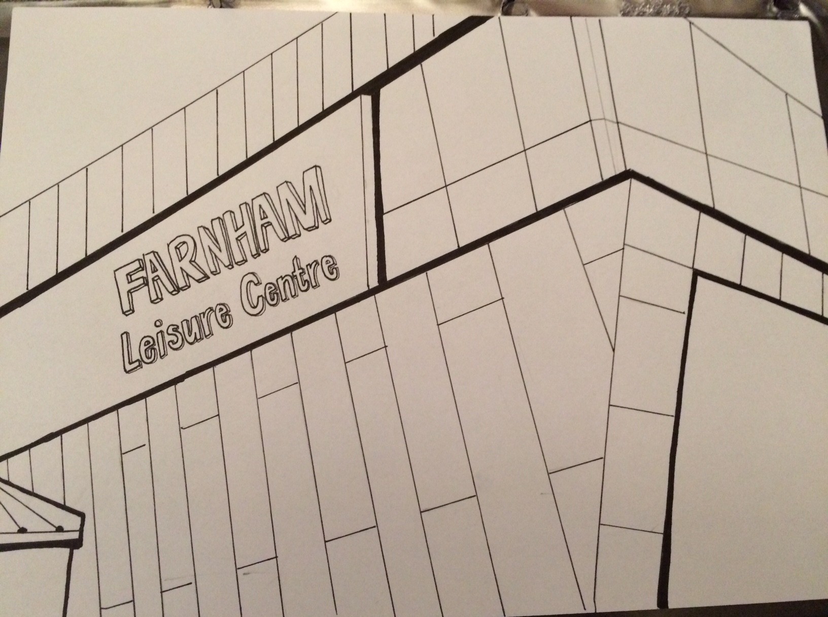
 On our second day, we spent the day walking around the town and drawing buildings on our way. Before we left, we were told about the importance of looking everywhere, and not taking what you see for granted. On my journey, I saw several different things I hadn’t seen before, such as wind dials, differences in building heights, and even a piece of sculpture. It was difficult to draw while walking, and as a result, my drawings aren’t as accurate or as detailed as I would have liked them to be. However, my favourite drawing of the day was one of Farnham Leisure Centre, a building with a modern design with bold angles and defined lines. To represent this in my drawing, I used a combination of fine liner and felt tip to communicate the strong edges of the building.

Farnham Leisure Centre

Farnham Leisure Centre

Other drawings I created included a drawing of Waitrose, of a fountain and a church. In each image I used different techniques to represent each building. I found that charcoal worked particularly well to convey the texture of brickwork.

On our last day of the week, we took a trip to London to see several exhibitions and galleries. Our first stop of the day was the Jerwood Space to see the Jerwood Drawing Prize – “the largest and longest running annual open exhibition for drawing in the UK” http://jerwoodvisualarts.org/jerwood-drawing-prize-2014 The exhibition featured all sorts of different drawings in all styles – some that I wouldn’t have even considered to be drawings before I saw them.

Our next visit was to the Tate Modern to look at a variety of work on display. I was particularly interested in the Poetry & Dream exhibition which predominantly featured work of the Surrealists. My favourite piece on display here was a piece called ‘Tiny Deaths’ by Bill Viola – a darkened room where three ghost-like figures appear. http://www.tate.org.uk/whats-on/tate-modern/display/bill-viola

Our final visit was to Somerset House where we saw the National Open Art exhibition: http://www.somersethouse.org.uk/visual-arts/national-open-art There was some really interesting work on display, of all different types, and it was really inspiring to look at. Also at Somerset House, we saw the AOI Illustration Awards, which was my favourite exhibition of the day: http://www.somersethouse.org.uk/visual-arts/aoi-illustration-awards-2014 There was so much interesting work to look at, in all different applications such as book covers, ad campaigns, little animations and more. My favourite work of the day was some illustrations by an illustrator called Andy Ward, who created some posters for a mental illness awareness campaign: http://ucsccares.ucsc.edu His images show animals in brightly coloured landscapes suffering with their problems. I think the design is so clever because you don’t realise until you look closely that the animals are suffering, similar to mental illness in real life.


http://www.drawger.com/andyward/images/0102755324.jpg AOI Illustration Award Winner, Andy Ward

AOI Illustration Award Winner, Andy Ward

Tagged , , , , , , ,

Visual Communication

After studying A Level Graphic Design, I was feeling more confident about this pathway than I had about the others. Our theme of the week was Systems and our task was to create a piece combining image and type in response to the system. After brainstorming ideas and looking at inspiration, I decided on the idea of recipes and cooking, as that is a strict order of steps that you must follow. After an introduction to semiotics – the study of signs – we began to explore typographical ideas by tracing fonts from a sheet. I created 8 different designs, combining different fonts in each, to represent my system.

-image1-

On our second day, we began to look at collage, creating images from pages taken from magazines. We experimented with collage by cutting out geometric shapes, figures and objects from the pages and replacing them.

IMG_0357-1 IMG_0359-1

After this activity, we created collages based on our particular theme/system, using a variety of found images, found papers and magazine cuttings. I created three collages, using a combination of drawing, sticking and 3D layering.

Scan 3

Scan 5

Scan 4I was most pleased with the egg collage as I felt that the limited colours, the use of masking tape and the simplicity of the design give it quite a relaxed feel while still having character and personality. My least successful design was the collage with the pan as it’s irregularity feels messy rather than playful, which was my original intention.

On our final day in the pathway, we combined our earlier type experiments with our collages, to create two final A3 pieces. I chose the most successful of my two collages and combined them with two different pieces of type – the ‘follow the recipe’ and ‘how does it taste?’ phrases. For both pieces, I scanned the collages in digitally and edited them in Photoshop before adding the type in Illustrator, using colours from the images to add to the type. I was really pleased with my final two outcomes and I think that they represent my system clearly whilst being entertaining and aesthetically pleasing in their own right.

how does it taste 2

follow a recipe 2

Tagged , , , ,

Fashion & Textiles

The title of our project this week was Macro-Evolutionary and our task was to design a body adornment that would be worn in a dystopian world. We had to create a narrative and a sequence of events that would lead to this dystopia:

Earth becomes uninhabitable (environmental disaster)

|

New planet discovered with similar conditions to Earth

|

Humans must relocate to new planet

|

Humans must adapt to new environment

I gained inspiration for my work and designs by creating concept boards around the theme of space. I gathered a variety of different images including space photographs, textiles, and film stills. I sketched some initial ideas and then began to focus on a particular idea:

IMG_0331

Sketchbook page

Inspired by images of an astronaut, I began to look at the idea of a breathing mask with breathing tubes attached. When designing my ideas, I was inspired by the work of Aitor Throup – http://aitorthroup.com – a fashion designer and artist whose work has a futuristic, military quality to it that linked well to this particular project.

On Thursday, I created my final body adornment, using wire to create a face mask and plastic packaging to create breathing tubes which were threaded through the mask. As no one wanted to model the final adornment for me, I took a picture of myself wearing the design. As the adornment was designed to combat the lack of oxygen in space, I wanted it to look futuristic and I took the photo on a plain white background. I also edited the photo, increasing the brightness and saturation to reflect a different style of lighting in space.

My final body adornment

My final body adornment

The final piece didn’t turn out exactly as I thought but I think that it has a futuristic quality and does look like a breathing apparatus which was the most important thing that I wanted to convey.

Tagged , , ,

Moving Image & Photography

This week was the turn of Moving Image & Photography – a pathway that I am considering for Part 2 of Foundation. I was really looking forward to creating an animation as I’ve done a bit of animating before but not in great detail. However, the first task of the week was to create a photo narrative where 12 photos would be used to tell a story. The theme of the narrative was Change and we decided to tell the story of a teddy bear who was thrown away and damaged.

 IMG_0306

I think our final outcome was successful with a variety of camera angles, and the story was clearly understood by everyone. However, our final piece had 13 photos rather than 12, and the last two photos were very similar. If we were to continue with the project, we would have needed to solve that small editing issue, which would also have improved the final layout by making it a neat grid. From our photography project, we were recommended to look at the work of Martin Parr and Anna Fox, due to the bright colours and objects we used in our work.

Home

Homepage

The next task of the week was to create a short animation morphing from one object into another using in-between animation. To gain inspiration for the task, we watched several examples of animation:

MUTO, a wall painted animation by BLU

Love & Theft by Andreas Hykade

Your Face by Bill Plympton

http://tu.tv/videos/bill-plympton-your-face-short-fi

My chosen object was a teacup which I had to morph into a plug. I chose to animate the plug breaking through the teacup and shattering it.

IMG_0302

After drawing the key frames of the start image – the teacup – and the end image – the plug – I drew the in-between frame. I then drew the frame in between the first image and the middle image, and the frame in between the middle image and the last image, and so on… After drawing 19 frames, I had a complete and smooth animation. When my animation was combined with the other members of my group, we had a finished, successful animation.

Tagged , , , ,

Fine Art

This week, I began the Fine Art rotation of my Foundation course. The project set was to create work around the theme of ‘Traces’.

I decided to create work around the theme of Internet Privacy and looked into the idea of being able to trace any information about any person online. I collected information about myself which could be found online: photos, my Facebook profile, emails, bank statements, order history, etc.

collection 1

  collection 2

To add a twist to this collection of items, I decided to pixelate and delete key bits of information. I wanted to explore the idea of how people wouldn’t give out private information in public but would freely put it up on the Internet where anyone could see it.

My final piece for the project was an installation using these pieces of information. At the centre of the piece was a broken laptop surrounded by the information in a sort of diagram.

internet privacy 1

internet privacy 2

I was really pleased with the outcome of my final piece as it had quite a dark, clinical tone to it which matched the theme and subject well. The word ‘traces’ was reflected in the use of string which linked the information and its origins.

I enjoyed my first rotation subject even though I found it quite difficult to generate ideas in a subject that is so free. Also, as I am used to a more specific, functional design brief, I found it more tricky to create a piece of art rather than a piece of design.

Tagged , , , , ,